按钮图标
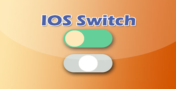
精美的纯CSS3滑动开关按钮
 PetitQ

这是一组使用 CSS3 制作的精美滑动开关按钮特效。这组滑动按钮按 Bootstrap 的情景类来设计,可以适应 5 种不同的场景,以及一种不可用的状态。
HTML 结构
该滑动按钮效果的基本 HTML 结构使用一个<div>元素来包裹一个<input>元素和两个<label>元素。
也想出现在这里?联系我们吧

<div class="switch-box">
<input id="default" class="switch-box-input" type="checkbox" />
<label for="default" class="switch-box-slider"></label>
<label for="default" class="switch-box-label">Default</label>
</div>
CSS 样式
第一个
.switch-box .switch-box-slider {
position: relative;
display: inline-block;
height: 8px;
width: 32px;
background: #d5d5d5;
border-radius: 8px;
cursor: pointer;
-webkit-transition: all 0.2s ease;
transition: all 0.2s ease;
}
.switch-box-slider 元素的::after 伪元素用于制作圆形的滑块。
.switch-box .switch-box-slider:after {
position: absolute;
left: -8px;
top: -8px;
display: block;
width: 24px;
height: 24px;
border-radius: 50%;
background: #eeeeee;
box-shadow: 0px 2px 2px rgba(0, 0, 0, 0.2);
content: '';
-webkit-transition: all 0.2s ease;
transition: all 0.2s ease;
}
当.switch-box-input 元素处于 checked 状态时,.switch-box-slider 的:after 伪元素的 left 属性被修改,圆形滑块被移动。
.switch-box .switch-box-input ~ .switch-box-label {
margin-left: 8px;
}.switch-box .switch-box-input:checked ~ .switch-box-slider:after {
left: 16px;
}
| 演示地址 | 下载地址 |
专业提供WordPress主题安装、深度汉化、加速优化等各类网站建设服务,详询在线客服!
也想出现在这里?联系我们吧