按钮图标
纯CSS3手绘风格卡通按钮设计效果
 PetitQ
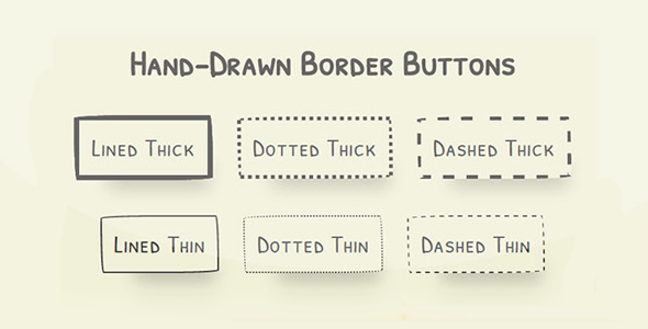
这是一组非常有趣的纯 CSS3 手绘风格卡通按钮设计效果。这组手绘风格按钮共 6 种不同的效果,它们以手绘涂鸦的方式,以不同的按钮边框线条宽度和虚线来构成按钮,效果非常不错。
HTML 结构
该手绘风格卡通按钮的 HTML 结构就是使用一个按钮<button>元素,配以不同的 class 类来实现不同的手绘风格按钮。
也想出现在这里?联系我们吧

<section>
<button class='lined thick'>Lined Thick</button>
<button class='dotted thick'>Dotted Thick</button>
<button class='dashed thick'>Dashed Thick</button>
</section>
CSS 样式
在这个 DEMO 中,整个页面以 flexbox 进行布局。页面字体使用的是一种手绘风格的谷歌字体。
@import url(https://fonts.googleapis.com/css?family=Patrick+Hand+SC);
html, body {
width: 100%;
min-height: 100%;
margin: 0;
display: -webkit-box;
display: -webkit-flex;
display: -ms-flexbox;
display: flex;
-webkit-box-orient: vertical;
-webkit-box-direction: normal;
-webkit-flex-direction: column;
-ms-flex-direction: column;
flex-direction: column;
-webkit-box-pack: center;
-webkit-justify-content: center;
-ms-flex-pack: center;
justify-content: center;
background: #F0F0D8;
font-family: 'Patrick Hand SC', cursive;
}html section, body section {
display: -webkit-box;
display: -webkit-flex;
display: -ms-flexbox;
display: flex;
-webkit-box-orient: horizontal;
-webkit-box-direction: normal;
-webkit-flex-direction: row;
-ms-flex-direction: row;
flex-direction: row;
-webkit-box-pack: center;
-webkit-justify-content: center;
-ms-flex-pack: center;
justify-content: center;
width: 100%;
min-height: 100%;
margin-bottom: 3rem;
}
所有的按钮的背景色都设置为透明,通过 padding 来设置按钮的尺寸,并为按钮设置一些阴影效果和圆角效果。还为按钮指定 0.5 秒的 ease 效果的过渡动画。
html section button, body section button {
-webkit-align-self: center;
-ms-flex-item-align: center;
align-self: center;
background: transparent;
padding: 1rem 1rem;
margin: 0 1rem;
-webkit-transition: all .5s ease;
transition: all .5s ease;
color: #41403E;
font-size: 2rem;
letter-spacing: 1px;
outline: none;
box-shadow: 20px 38px 34px -26px rgba(0, 0, 0, 0.2);
border-radius: 255px 15px 225px 15px/15px 225px 15px 255px;
}
上面的圆角设置等价于下面的代码:
border-top-left-radius: 255px 15px;
border-top-right-radius: 15px 225px;
border-bottom-right-radius: 225px 15px;
border-bottom-left-radius:15px 255px;
然后分别为 6 种不同的手绘风格按钮的指定各自的边框样式。
html section button.lined.thick, body section button.lined.thick {
border: solid 7px #41403E;
}html section button.dotted.thick, body section button.dotted.thick {
border: dotted 5px #41403E;
}html section button.dashed.thick, body section button.dashed.thick {
border: dashed 5px #41403E;
}html section button.lined.thin, body section button.lined.thin {
border: solid 2px #41403E;
}html section button.dotted.thin, body section button.dotted.thin {
border: dotted 2px #41403E;
}html section button.dashed.thin, body section button.dashed.thin {
border: dashed 2px #41403E;
}
在鼠标滑过按钮时,修改按钮的阴影效果。
html section button:hover, body section button:hover {
box-shadow: 2px 8px 4px -6px rgba(0, 0, 0, 0.3);
}
最后,使用媒体查询来制作在小屏幕上的布局效果。
@media (max-width: 620px) {
body h1 {margin-top: 2rem;
}body section {display: -webkit-box;
display: -webkit-flex;
display: -ms-flexbox;
display: flex;
-webkit-box-orient: vertical;
-webkit-box-direction: normal;
-webkit-flex-direction: column;
-ms-flex-direction: column;
flex-direction: column;
-webkit-box-pack: center;
-webkit-justify-content: center;
-ms-flex-pack: center;
justify-content: center;
margin-bottom: 1rem;
}body section button {
-webkit-align-self: center;
-ms-flex-item-align: center;
align-self: center;
margin-bottom: 2rem;
}}
| 演示地址 | 下载地址 |
专业提供WordPress主题安装、深度汉化、加速优化等各类网站建设服务,详询在线客服!
也想出现在这里?联系我们吧